
Here at Apparatus, not only do we design and develop custom websites for our clients, we also review, critique and work with our clients to re-strategize websites on a regular basis. We have many years under our belt and that means we have seen it all. The GOOD, the BAD, the UGLY.
When a user lands on your home pages, you want them to understand exactly what your business provides, the community that you serve and what makes your business different within the first 3-5 seconds after hitting your websites. Below we are providing you with a quick and easy list that hits on all of these points. If your website is not converting or it is not attracting your ideal client we suggest reading through this tips and the easy to implement solutions that will make a HUGE IMPACT! We want to take your ideal cleints from totally turned away to totally tuned in.
WHEN we review a website we are looking for a few key takeaways and walk through the following mental checklist:
- Do I have a clear idea of what this business is, what they do and who they serve?
- Do I see a clear CTA “Call To Action” and have a clear understanding of what to do next.
- Is the design of the site flowing seamlessly with the brand or is it distracting?
- Are there goals on the page? Is there a purpose to the page and does it guide the user through the website?
- Is the content concise or overwhelmingly wordy.
Based on our experience and having worked through this checklist numerous times, we’ve noticed that most websites on the internet is making at least one, if not all, of the mistakes below.
Keep reading as we share our tips and tricks so you can get your site back on track.

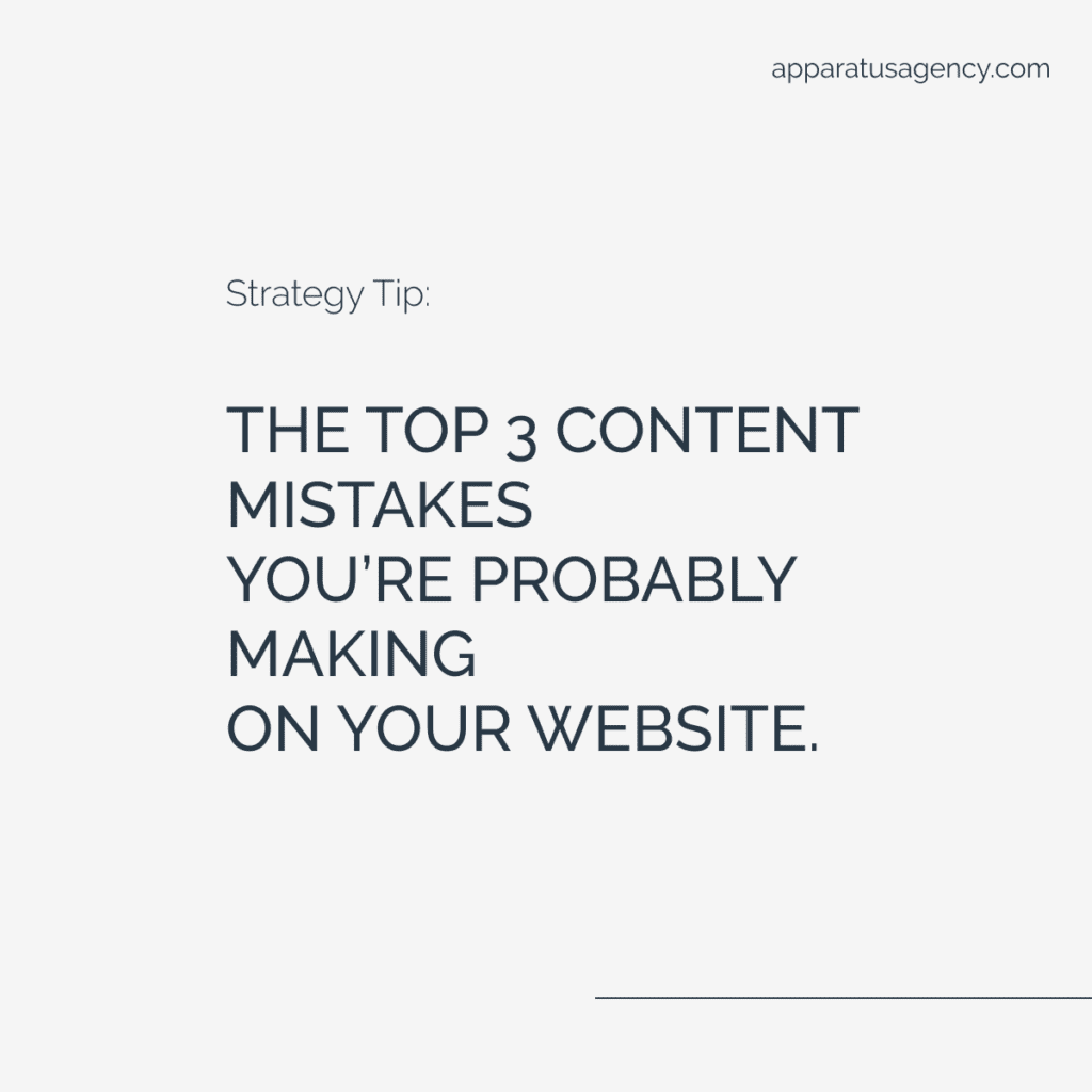
The Top 3 Mistakes You Are Probably Making On Your Website.
1: Absence of Strong CTA’s
We see this one quite often. Consider how you would guide your client through your site and what request you would like them to respond to.
This is where you really create a journey your client will take. Not having strong CTA’s on your site is similar to expecting a response when no request has been made.
This leaves your user confused, and without a clear direction. The client will leave and will likely not return.
Take a run through of your site, verify there is 1 strong request on each page and that this request reflects your end conversion goal.
2: Not having Concise content
Too much content is overwhelming, can leave a client confused and will likely cause high bounce rates.
Steve Krug and usability expert said “Making every page or screen evident is like having good lighting in a store: it just makes everything seem better.”
The hard truth is that people just do not read anymore! They are scrolling way to fast to real all the flowery language you have written.
The fix? Cut our the fluff. Get rid of half the words on each page, then cut it in half again. What is left, that is what you want on your site. Only keep the MOST IMPORTANT INFORMATION.
3: Not having page goals
We already talked about having STRONG CTA’s but the second bit of this is keeping CTA’s to a page minimum.
Consider what you need from each page. Consider how you need users to convert. Asking too much from a user will cause more confusion and lead to higher bounce rates.
What is the most important request you are making of your users and drive them to that request.
Let’s wrap this up!
Take a hard look at your homepage, or better still, ask a cient, customer, blog reader to take a look at your site and give honest feedback. Make a few if of the tweaks we mentioned above, they will make an impact.
Do you feel like you are ready for a website overhaul or ready to start a new design? Feel free to reach out to us, we are here to help!
LOVE THIS TIP?
Save this to Pinterest for safe keeping!